Project Duration
6 Months
Services Provided
UX Design, UI Design, Brand Application, Prototyping
From My5 to 5
As part of Channel 5's wider rebrand, My5 was relaunched as "5" — unifying the brand across broadcast and digital. As lead designer, I was responsible for translating the new visual identity across every screen: introducing a bold design language centred on ink blue, vivid yellow, and energetic pink, while also redesigning and improving core user journeys.
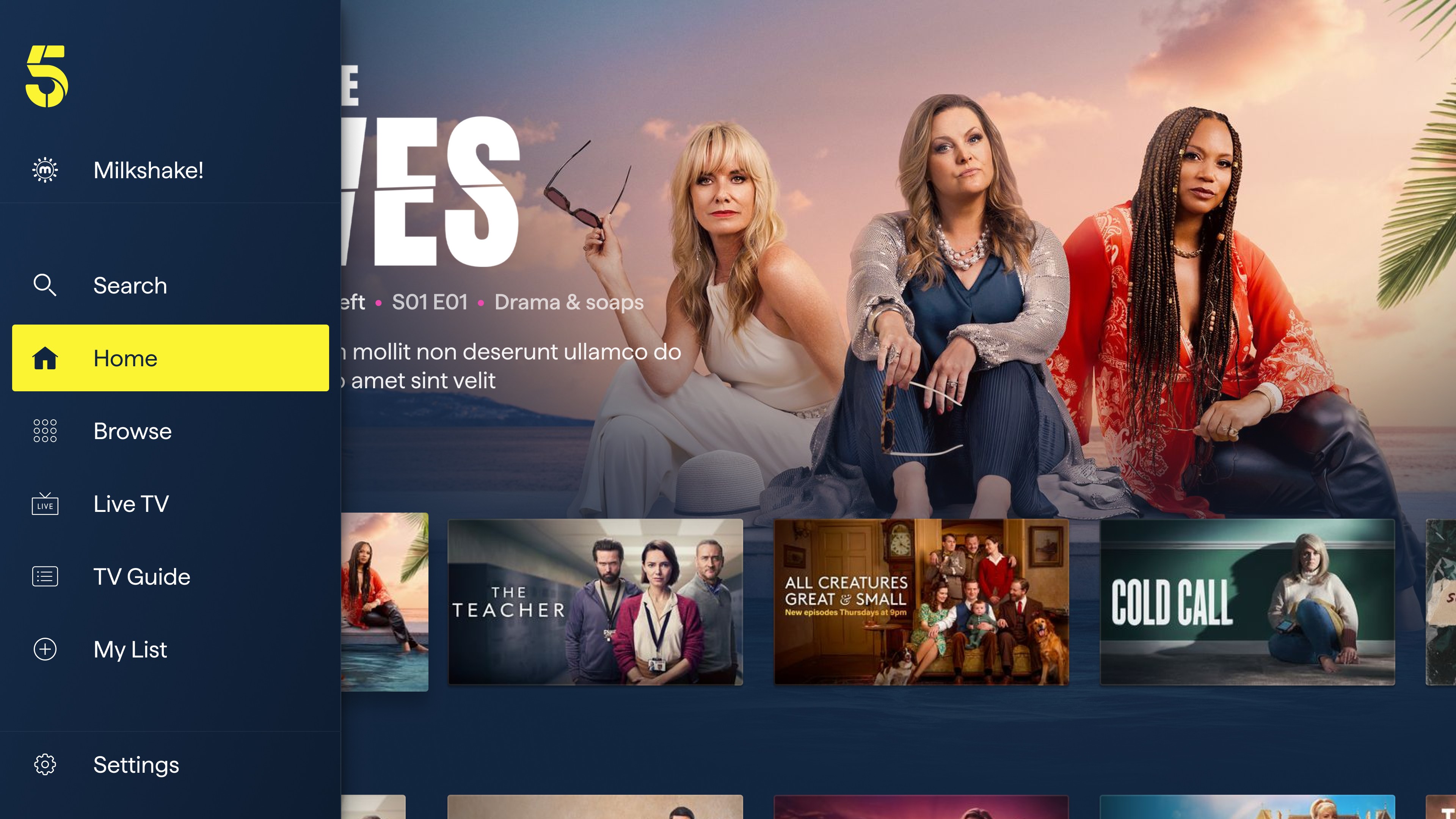
The rebrand touched every surface of the product — the app icon, splash screen, navigation, home screen, browse, Live TV, show pages, and video player — all reimagined with the new "5" identity at their core. Alongside the brand rollout, we introduced two major new features: Fast Channels and Top 10.
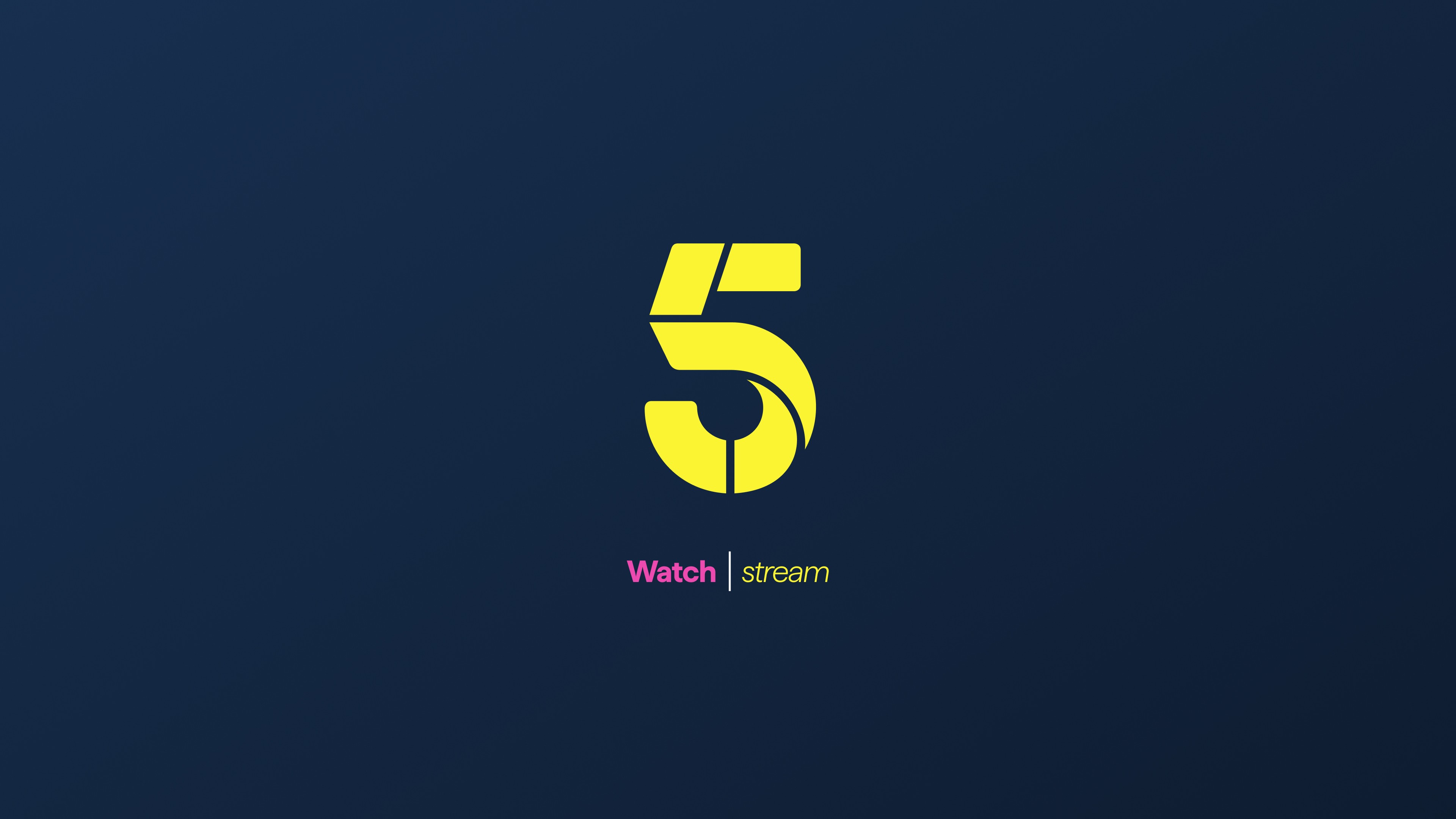
The rebrand begins at the first touchpoint. The yellow "5" mark on a deep ink blue background replaces the My5 identity. The splash screen introduces the "Watch | stream" line, reinforcing 5's identity as both a live broadcaster and an on-demand platform.
Every surface of the product is reimagined from day one.
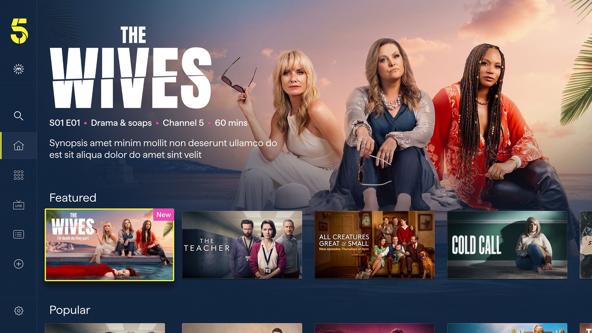
Show Page
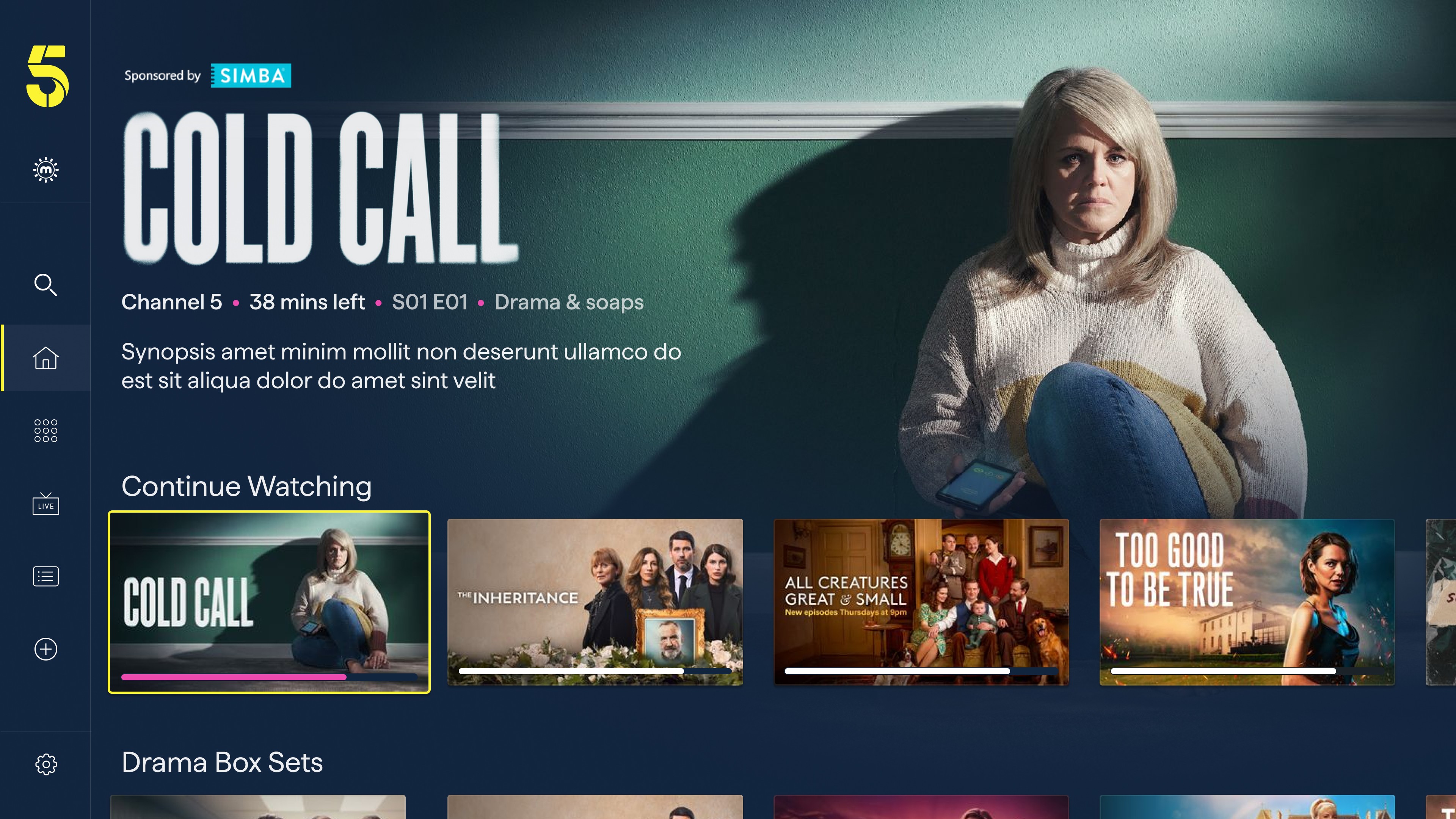
Redesigning the show page was one of the most impactful screens to redesign. Although the changes were small, the interface's overall impact was significant. The updated layout features a cinematic full-bleed hero and title treatment, metadata and contextual CTAs that change based on the user's state.
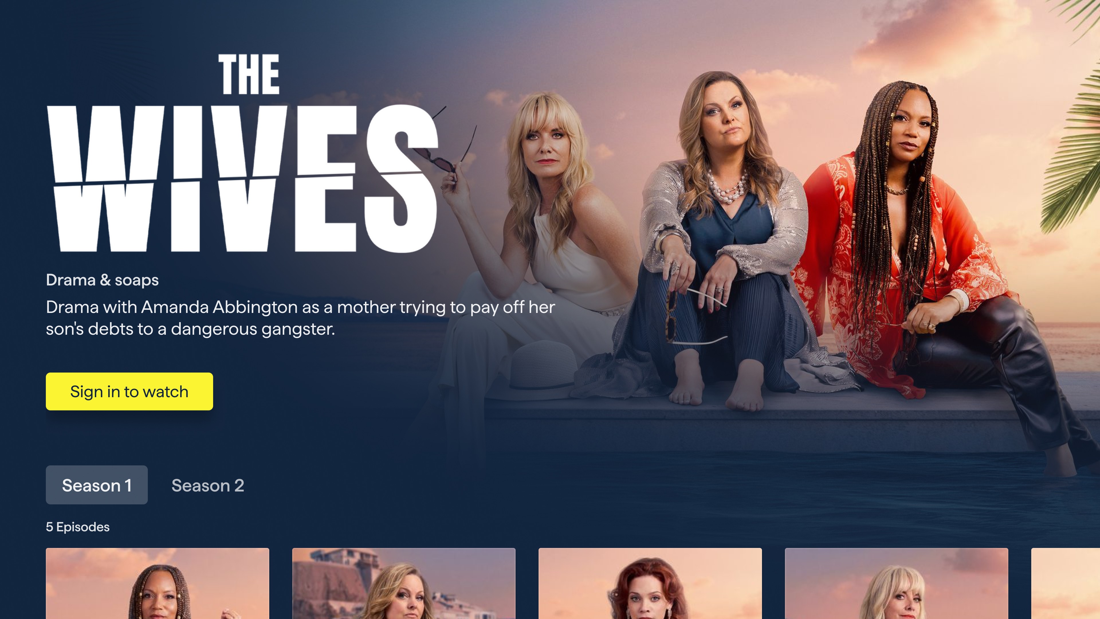
First-time visitors see a clear "Sign in to watch" call to action, while returning users see a "Continue Watching" button with their current episode and time remaining displayed immediately, alongside a progress bar
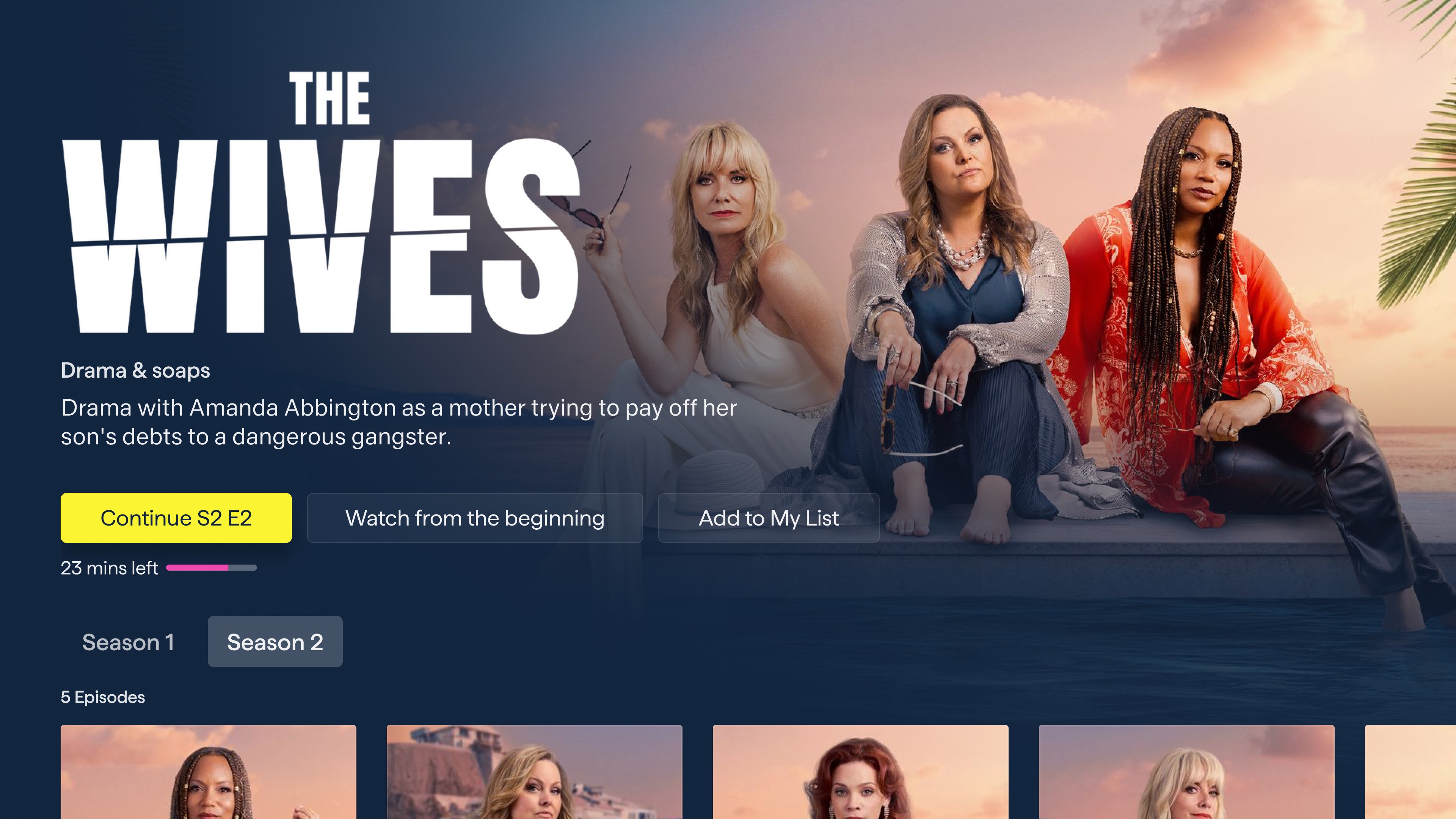
CTA label choices on the show page were refined through testing. "Watch from the beginning" consistently outperformed short options such as "Restart" despite being the least visually compact. The alternatives caused confusion: users were unsure whether they'd be restarting the current episode or the entire show from the first episode. "Watch from the beginning" removed that ambiguity entirely, and users chose with more confidence as a result.
Watch from the beginning, outperformed every alternative. Clarity always wins.
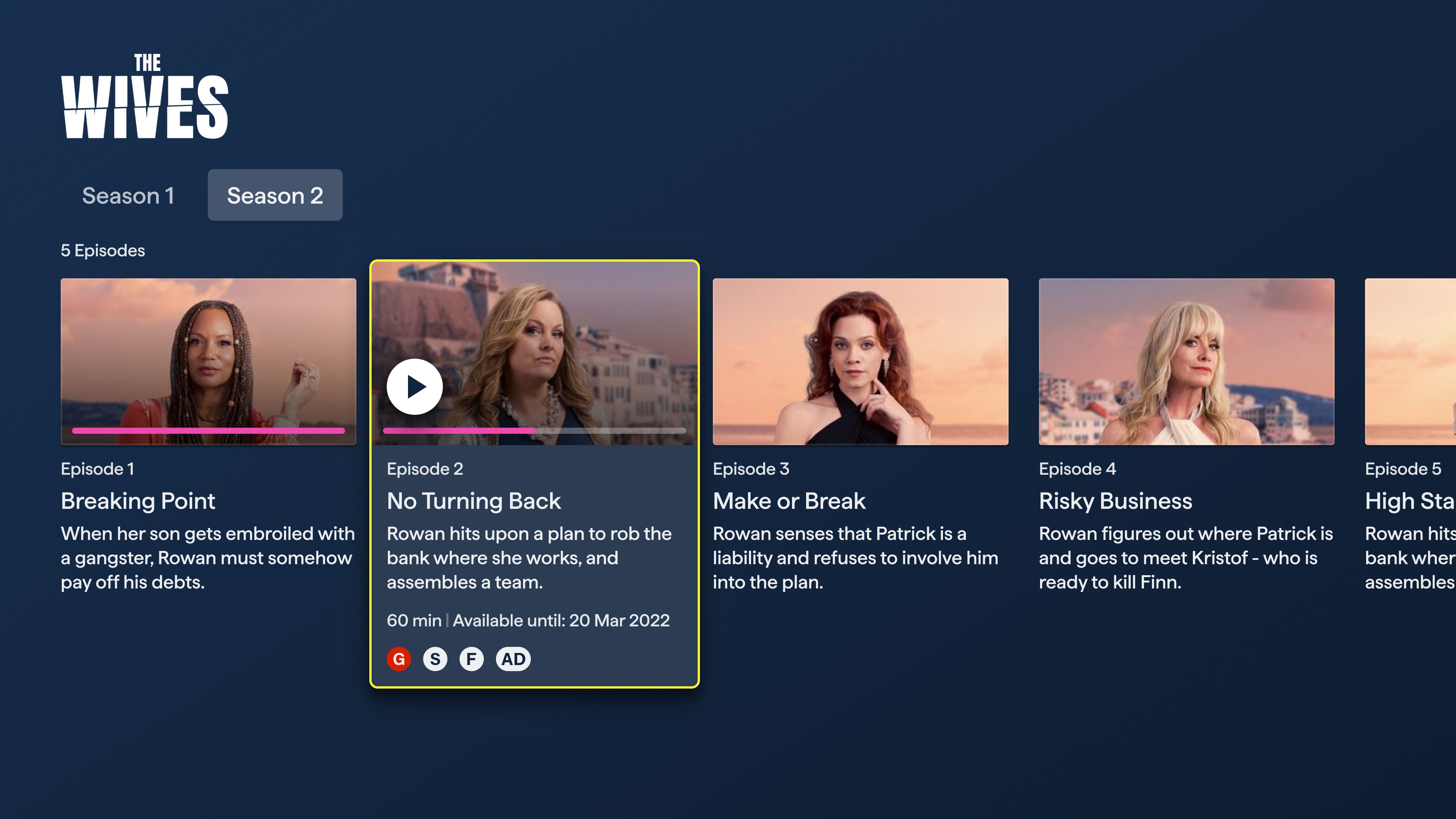
Title treatments - the official show logo lockups - were implemented for every title in the catalogue as part of the show page redesign. Where previous layouts relied on plain text, the new show page leads with the title art prominently in the hero and deliberately keeps it in view as users scroll down to episode selection. Rather than collapsing or swapping to a text label, the title treatment remains, anchoring the show's identity throughout the browsing experience and giving the layout a more editorial, premium feel.
Playback
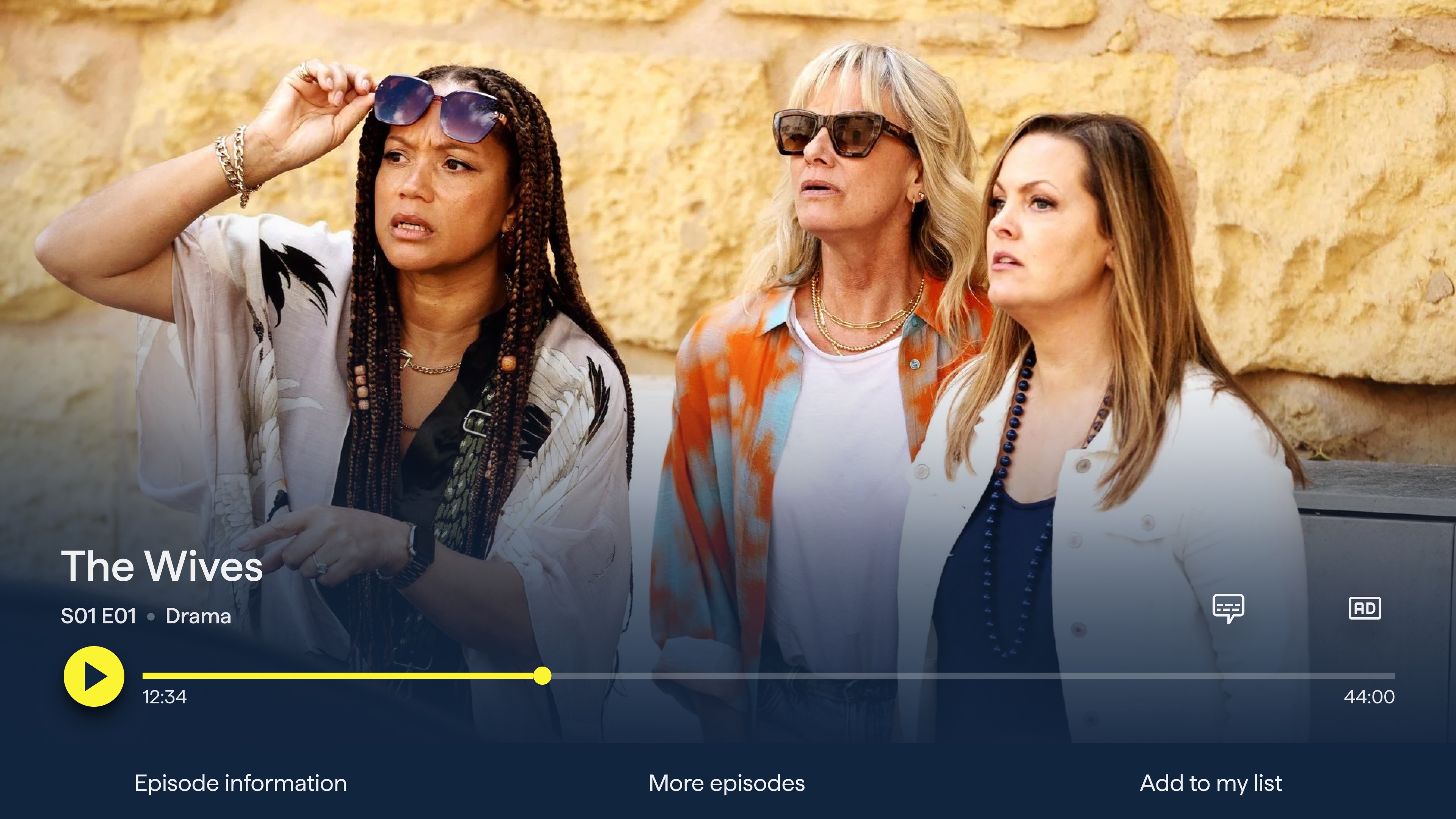
The video player was redesigned to feel clean and cinematic. When paused, a minimal control overlay surfaces with a pink progress bar, playback time, and quick-access buttons for subtitles and resolution settings. Secondary actions - episode information, more episodes, and add to list - are surfaced in a bottom bar, keeping the main controls uncluttered.
Project Duration
6 Months
Services Provided
UX Design, UI Design, Brand Application, Prototyping
From My5 to 5
As part of Channel 5's wider rebrand, My5 was relaunched as "5" — unifying the brand across broadcast and digital. As lead designer, I was responsible for translating the new visual identity across every screen: introducing a bold design language centred on ink blue, vivid yellow, and energetic pink, while also redesigning and improving core user journeys.
The rebrand touched every surface of the product — the app icon, splash screen, navigation, home screen, browse, Live TV, show pages, and video player — all reimagined with the new "5" identity at their core. Alongside the brand rollout, we introduced two major new features: Fast Channels and Top 10.
The rebrand begins at the first touchpoint. The yellow "5" mark on a deep ink blue background replaces the My5 identity. The splash screen introduces the "Watch | stream" line, reinforcing 5's identity as both a live broadcaster and an on-demand platform.
Every surface of the product is reimagined from day one.
Show Page
Redesigning the show page was one of the most impactful screens to redesign. Although the changes were small, the interface's overall impact was significant. The updated layout features a cinematic full-bleed hero and title treatment, metadata and contextual CTAs that change based on the user's state.
First-time visitors see a clear "Sign in to watch" call to action, while returning users see a "Continue Watching" button with their current episode and time remaining displayed immediately, alongside a progress bar
CTA label choices on the show page were refined through testing. "Watch from the beginning" consistently outperformed short options such as "Restart" despite being the least visually compact. The alternatives caused confusion: users were unsure whether they'd be restarting the current episode or the entire show from the first episode. "Watch from the beginning" removed that ambiguity entirely, and users chose with more confidence as a result.
Watch from the beginning, outperformed every alternative. Clarity always wins.
Title treatments - the official show logo lockups - were implemented for every title in the catalogue as part of the show page redesign. Where previous layouts relied on plain text, the new show page leads with the title art prominently in the hero and deliberately keeps it in view as users scroll down to episode selection. Rather than collapsing or swapping to a text label, the title treatment remains, anchoring the show's identity throughout the browsing experience and giving the layout a more editorial, premium feel.
Playback
The video player was redesigned to feel clean and cinematic. When paused, a minimal control overlay surfaces with a pink progress bar, playback time, and quick-access buttons for subtitles and resolution settings. Secondary actions - episode information, more episodes, and add to list - are surfaced in a bottom bar, keeping the main controls uncluttered.
Fast Channels
Fast Channels (Free Ad-Supported Streaming TV) was a major new feature introduced as part of the rebrand, bringing Channel 5's family of branded linear channels into the streaming app for the first time.
Note: Some of the channels featured in the designs are merely placeholders and are not available in the app.
User Testing Insights
During user testing sessions, one finding shaped the entire layout of the TV Guide: users were not trying to plan ahead - they wanted to know what was on right now, across as many channels as possible, at a single glance. Knowing what was coming next in an hour was secondary; what mattered was being able to scan all live content simultaneously before making a choice.
This insight drove a clear design decision: maximise the number of channels visible on screen at once. Rather than a traditional horizontal programme guide with wide-landscape cards and a multi-column schedule, we adopted portrait channel cards - a more compact format that allowed significantly more channels to fit on a single screen without scrolling. The result is a player that merges the functionality of a live TV dial and a minimal TV guide.
Users weren't trying to plan ahead. They wanted to know what was on right now, across every channel, at a single glance.
TV Guide
The redesigned TV Guide gives users a clear, scannable overview of what's live across all channels simultaneously — 5, 5USA, 5Star, 5Action, 5Select and more. Each row surfaces the current programme's thumbnail, title, and time remaining, with Next and Later slots visible in a lighter secondary format. Users can browse at a glance and drop into any live stream directly from the guide.
Live Player
The Live Player was redesigned as well: a fast channel-switching rail sits at the bottom of the player, letting users flip between channels without leaving the player - a behaviour familiar from traditional TV, now native to streaming.
Motion and transitions have been intentionally kept to a minimum to reflect performance constraints on certain TV platforms where the product was deployed.
Mobile
The mobile experience brings Fast Channels to iOS with the same guiding principle: maximum live content at a glance, adapted for how people use their phones.
By default, Live TV is muted. This was a deliberate accessibility decision - ensuring screen readers can continue to function without competing with live audio the moment the tab is opened. Users unmute when they're ready, on their own terms.
By default, Live TV enters muted — a small decision with a big impact for screen reader users.
Rotating the phone or tapping the expand button triggers a seamless transition to full-screen playback. Rotating back shrinks it back to the mini player, returning the user to the guide exactly where they left off. No extra taps, no interruption.
In full screen, the player keeps controls minimal — a yellow progress bar, restart, subtitles, audio description, and show info. Accessibility actions are surfaced as first-class controls rather than buried in settings, consistent with the approach across all platforms.
Top 10
Top 10 is a new editorial feature that surfaces the most-watched content in the UK in real time. Integrated directly into the home screen as a dedicated numbered rail, it gives users an immediate cultural pulse — a quick answer to "what is everyone watching right now?" - while driving engagement with trending content they might otherwise miss.
Each card displays the show's title art alongside a large numeral, creating a visually bold and immediately scannable rail format.
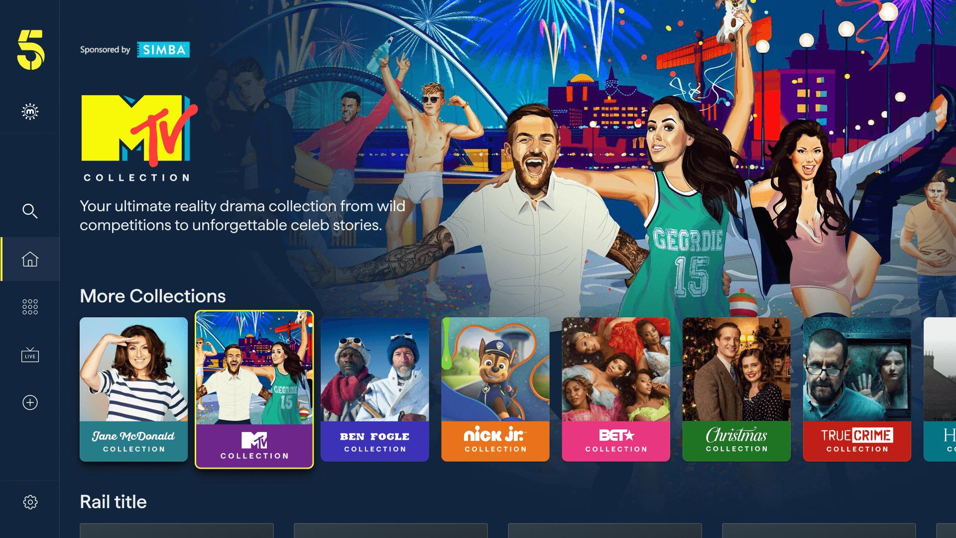
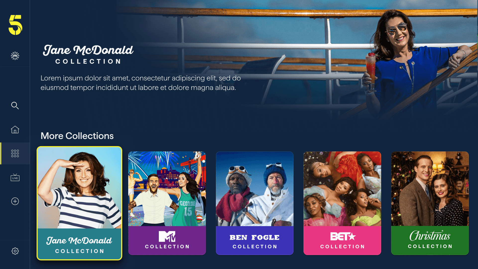
Collections
Collections was introduced to give Channel 5's editorial team far greater creative control — the ability to package content around a brand partnership, a cultural moment, a genre mood, or a talent relationship, and present it with its own visual identity and narrative. Think "MTV Collection," "Jane McDonald Collection," or "True Crime Collection," each with a distinct look and feel within the same app.
A new editorial feature — built entirely from components that already existed.
Built on What Already Existed
The key design challenge was delivering a fully flexible editorial destination without extending the component library or impacting the delivery timeline. The solution was to assemble Collection pages entirely from existing building blocks already in the product - the full-bleed hero, title treatment, synopsis, portrait show rails, landscape episode cards, and the "More Collections" discovery rail - rearranged and editorially configured rather than built from scratch.
This allowed Collections to be implemented more rapidly, enabling the editorial team to independently create and update pages via the CMS without needing engineering support.
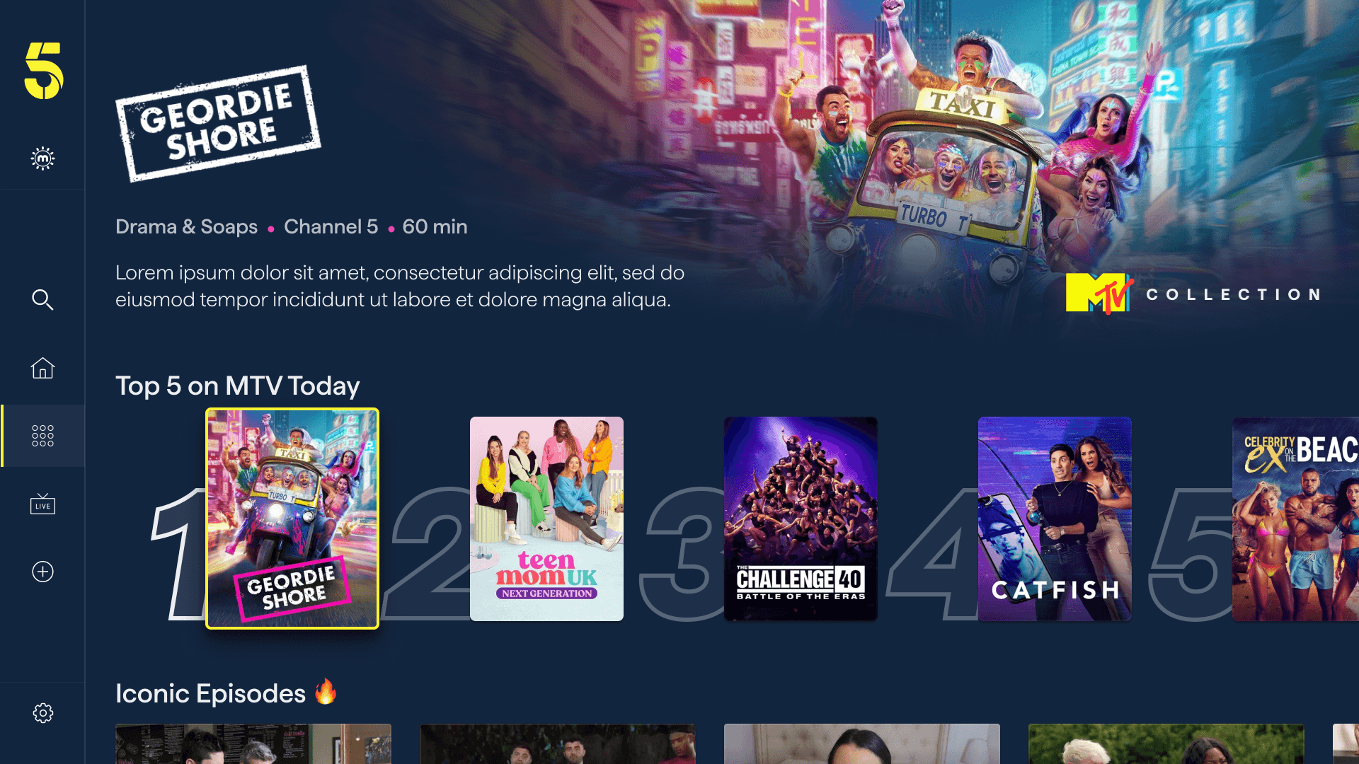
A numbered "Top 5" rail — a contextualised variant of the Top 10 feature — gives each Collection its own trending moment: "Top 5 on MTV Today," for example. These portrait cards create a bold, scannable row that gives the most popular content in that collection visual prominence via large background numerals.
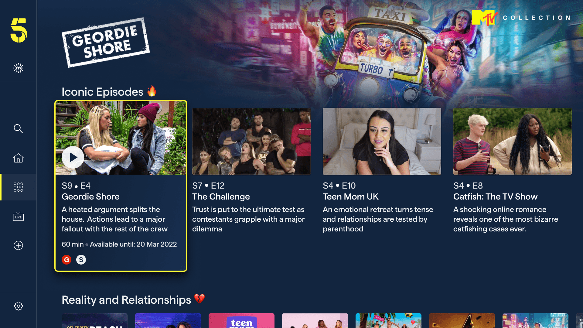
Genre or mood rails ("Reality and Relationships 💔," "Iconic Episodes 🔥") add editorial personality through emoji-accented labels and draw on the landscape episode card format — the same component used in the show page — surfacing episode-level metadata: series, episode number, title, synopsis, duration, and availability date.
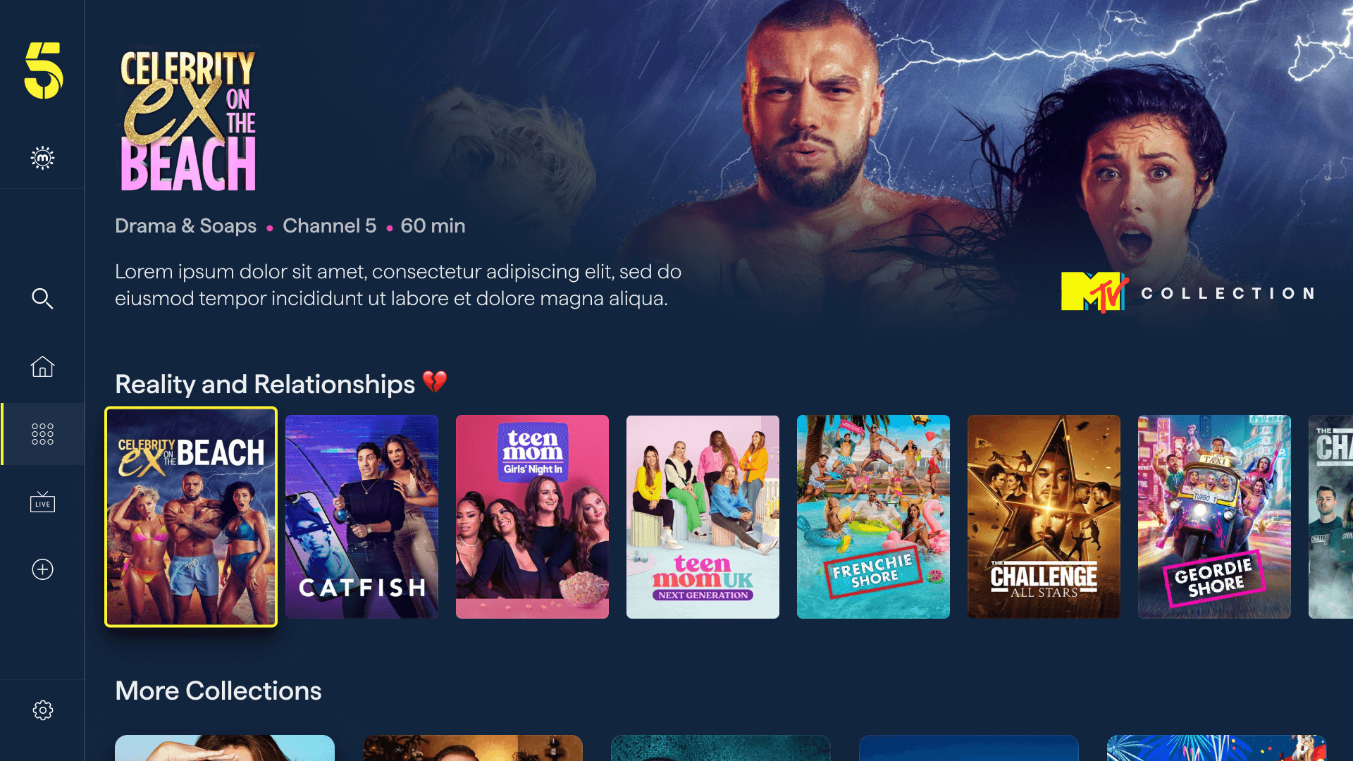
A "More Collections" rail at the bottom of each page ties the feature together as a network. Each collection card uses a distinct branded thumbnail — Jane McDonald's portrait photography, MTV's illustrated artwork, a Christmas scene — so the rail itself becomes a visually rich editorial directory. This loop ensures users are always one step away from the next collection rather than reaching a dead end.
What It Enables
For Channel 5, Collections unlocks a new lever for both commercial and editorial. Branded partner collections can be sold as premium placements, with full creative control over how the partner's content is curated and presented. For users, it's a new way to discover content they might not find through search or browsing alone - guided by editorial intent rather than by algorithmic ranking.
Conclusion
The 5 rebrand was one of the most comprehensive projects I've worked on - touching every screen, every state, and every platform simultaneously. The challenge was ensuring the new brand elevated rather than disrupted the experience users already knew.
By treating the ink blue, yellow, and pink palette as a living system, each screen found its own balance between brand expression and content focus - the show's artwork always leads, the UI supports it.
The simultaneous introduction of Fast Channels, Top 10 meant each new feature was designed to feel native to the "5" experience from day one - not as add-ons, but as core parts of what the app is.
Thank you for watching.
All content, imagery, and intellectual property featured in this case study belong to Channel 5 Broadcasting Limited. This work is presented solely for portfolio purposes to demonstrate design contribution.